w3-o
Loading

Design + Print / Production

beyond the studio // September 25, 2013

It’s not a T-Shirt – It’s an Idea!

In the multiple Oscar-winning film “Forrest Gump”, one memorable scene shows how the lead character (played by Tom Hanks) accidentally ‘creates’ “Smiley Face” when he wiped dirt off his mud-covered face with a t-shirt. While the movie’s origins story is fiction, the fact that a t-shirt is a compelling medium of expression and can even become a catalyst in the creation of pop culture icons such as the aforementioned “Smiley Face” – that is very real. Originally issued as an undergarment by the U.S. Navy around the time of the Spanish American War, the humble t-shirt’s popularity has grown leaps and bounds largely because of its simplicity and practicality.


At W3-O, t-shirt designs are by no means created by accident nor are they mere trendy, “pretty pictures”. Instead, these are borne out of well-thought, strategic processes and considerations. Through the years, we have had our fair share of t-shirt designs – done for different clients and purposes such as humanitarian projects, internal usage, campaigns, etc.


From Support Cast to Star

When W3-O designed the t-shirt for the Madhu Duniya event, a jamboree of forest honey harvester of Asia, the objective was to provide support to the event’s other collaterals. This wasn’t meant to be. The organisers loved the design so much because it clearly conveyed the event’s message, that they eventually chose it as the main logo. So when in most cases, the t-shirt design will follow the corporate/event logo, it became the other way around. Talk about the “tail wagging the dog”, so to speak.
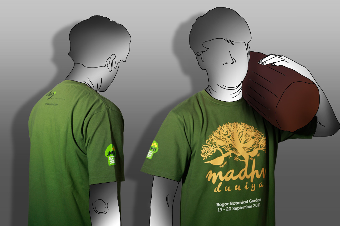
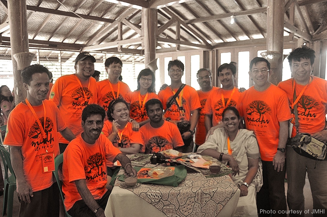
 

Madhu Duniya T-Shirt

Madhu Duniya Conference 2011


Simple can be Spectacular

More often than not, W3-O faces budgetary constraints especially when humanitarian clients are concerned. The THF volunteer t-shirt is a prime example. The brief was single-mindedly simple: it shouldn’t cost so much to print, thus, it’s a single colour print. We thought a single colour is not an excuse to look sub-standard. After all, THF also wanted to merchandise them so, it must really look like something that they could wear many times and be proud about it – pretty much like when you’re wearing a cool surfing t-shirt. This is what the red-hot shirt projected with its unique ball of rope mash-up with the THF logo to signify how all of us are connected and that we need help each other by reaching out, lending a “rope” to hold on. Simple, but intensely meaningful.
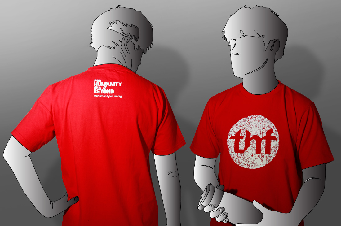
 

THF T-Shirt

THF T-Shirt


Long Lasting Ideas

Once upon a time, we were challenged to design an internal t-shirt. Problem is we only need to print about 25 pieces. Usage would be fairly “rare”, maybe 2-3 times a year so while we were initially very sceptical about it, we decided to go for hot iron printing. The thing is, there are a lot of limitations with this method, so many cons. But one of the pros is that this method also allows us to have “unlimited colours” and high details. Our designer had to give his brain juice a little extra squeeze. And it paid off well. Three years later, the t-shirts still look awesome!
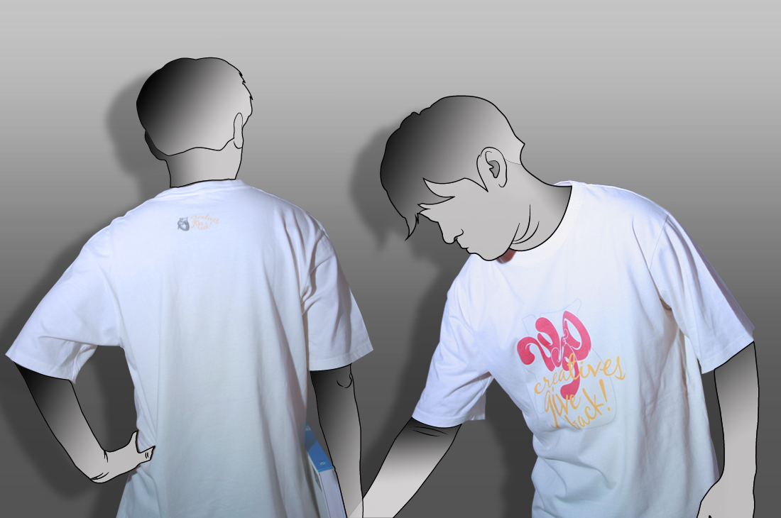
 

w3-o Charity Mission


Heart of the Matter

For our humanitarian mission to Mantalongon, Cebu, The Philippines, we wanted a t-shirt design that encompassed the mission’s theme, “Let’s Colour Up Their Life”. The mission was in support of the educational needs of some 305 kids from the Living Gospel Community, mostly from poor families whose parents are fishermen, construction workers, labourers and carpenters. The result was this colourful, stylised heart design which is an apt symbol of hope that cheered up these kids who were otherwise living “black and white” lives.
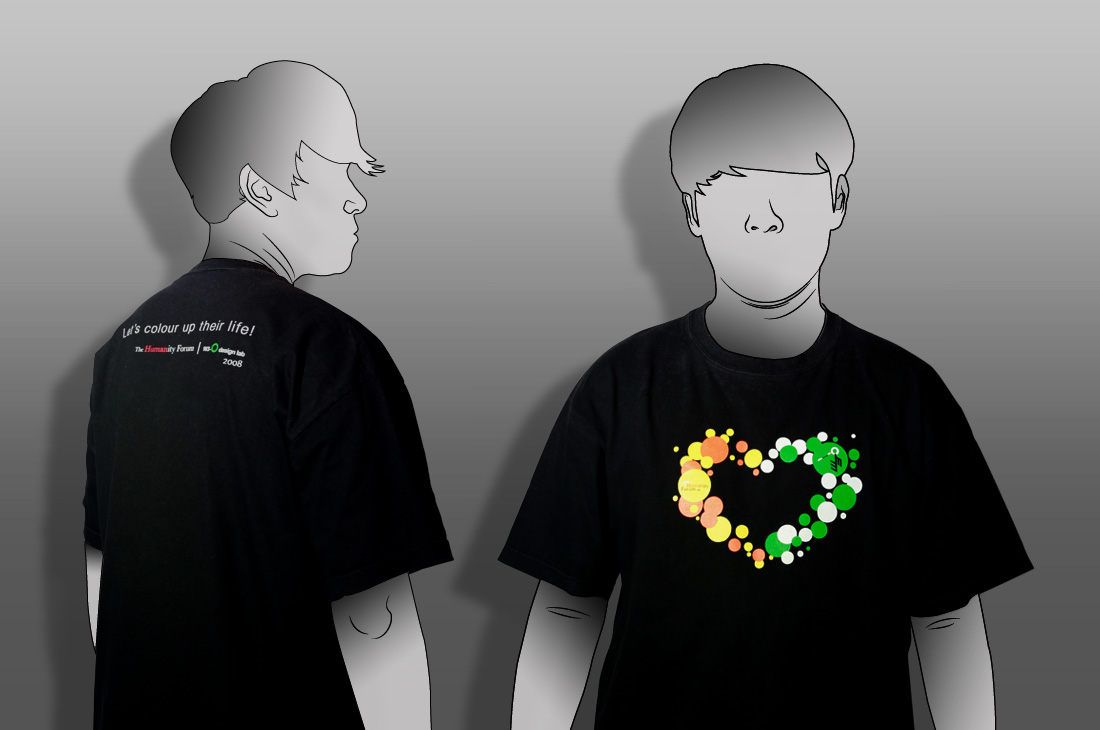
 

THF T-Shirt for Cebu mission


The Kids Says Alright

For the Media Development Authority of Singapore, media ratings may be a boring topic for a road show, with students to target at that. W3-O’s marching orders were to create a fun giveaway t-shirt as part of this national campaign, one that has to be very fun, particularly to the young folks that the government agency is targeting. The result is a chic yet edgy looking t-shirt design that just about anyone would love to wear – regardless of the media ratings that are literally printed on it to boot!
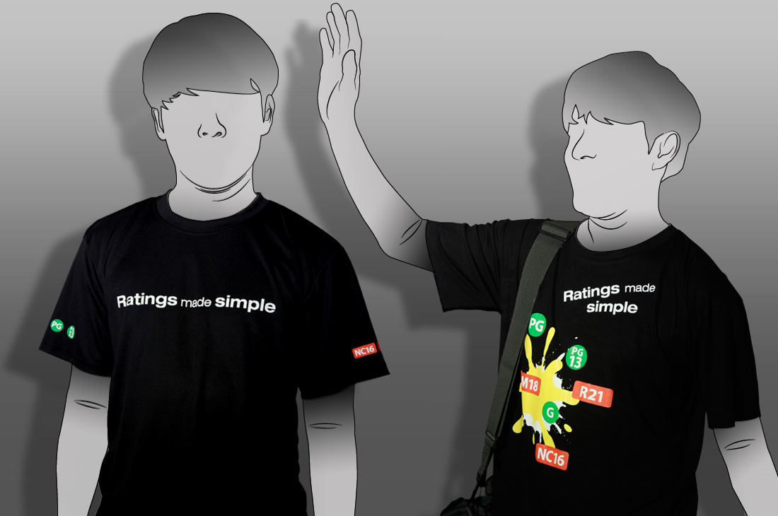
 

MDA T-Shirt


Take One for the Team

Again, for this project, W3-O had to “take one for the team”, as a manner of speaking. After all, budget is a major constraint. And the challenges are even more daunting. We needed to create a shirt where people could recognise Team9 members immediately in a disaster hit area. Of course, this is not our first time working with non-profit organisations, so when they mentioned about the budget, we thought, “brain-squeezing time” again.

To create this t-shirt design, we had to consider the situation where Team9ers will wear them. These places could be very messy and chaotic. While soldiers and police forces wear uniforms, Team9 volunteers could be mistaken as tourists, local workers or even some dodgy people who try to profit from disaster. The t-shirt is the first point of recognition for the team. Next, we need to “loudly” convey 2 things immediately: team name/logo and volunteer identity. It has to be loud since helpers could also easily be the victim in these situations. In case they get stranded or lost, people could spot them right away. Last but not least, as relief and “rebuilding” workers, we are supposed to bring hope to the disaster stricken area. So, we want Team9 to appear like the “hope” themselves. Hence, W3-O decided to avoid sombre colours and instead used the cheerful and bright red.

After it was tested on several humanitarian missions, Team9 appreciated our “hope and cheerful” concept as it really gave the vibe they wished to impart with the victims, particularly the IDPs (Internally Displaced People): A strong will to rebuild their lives with dignity.
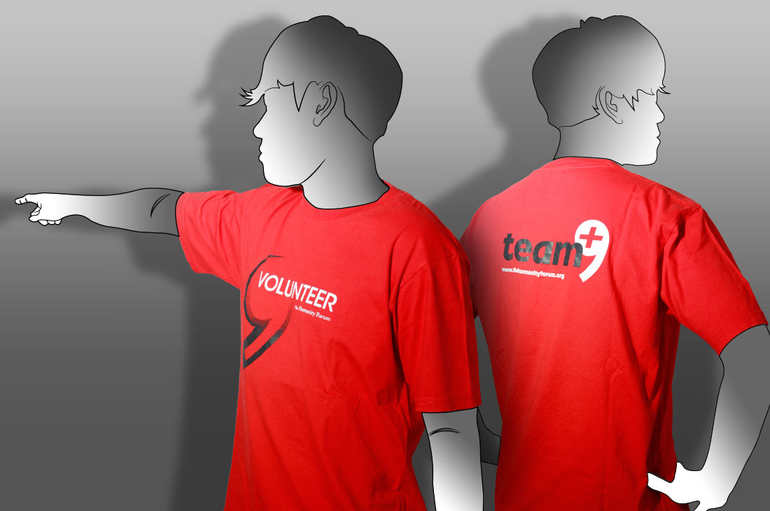
 
Team9 T-Shirt


As all these projects show, each t-shirt design goes beyond the confines of artistic discipline but very much into factors such as branding, function, budget constraints, and technical considerations. In the end, each of them succeeds in telling a story, conveying a message, promoting an idea – or all of the above. Each has served a purpose like creating high visibility and impact, or provoked an emotion.

Perhaps in the long run, they too can become pop culture icons like “Smiley Face”, but more than that, we prefer they become symbols that touch hearts and improve humanity.

 

beyond the studio // December 2, 2011

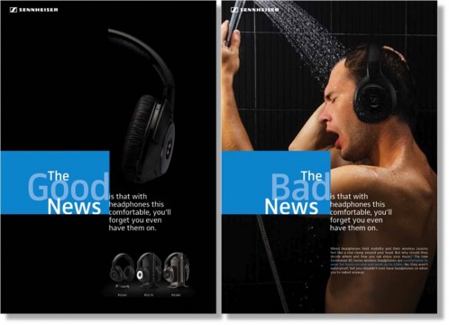
Sennheiser Electronic

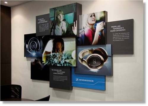
The global marketing office of Sennheiser headphone category.
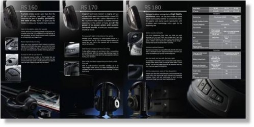
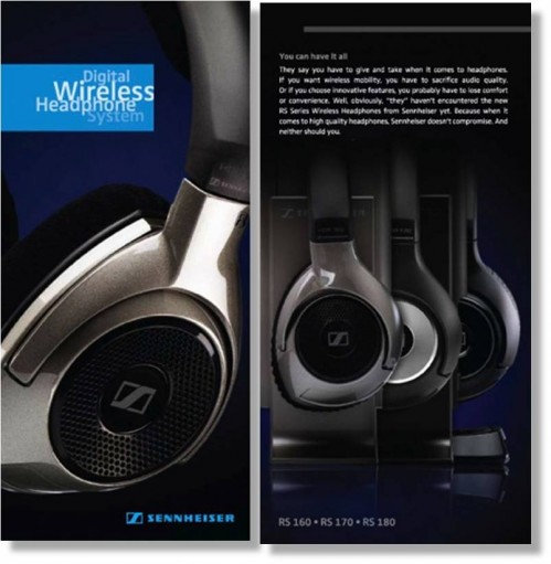
W3-O is in charge in developing all the marketing collaterals (BTL) Including the management and production of their product images.
Product Global Launch Ads

Product Brochures

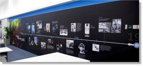
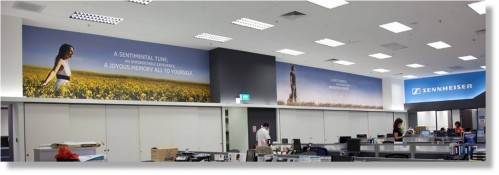
Murals

beyond the studio // June 2, 2011

The Joy of Passion

Remember the first time you…

…fell in love?
…were inspired, driven to turn your desire into reality?
…felt passionate about doing something continuously and not get sick of it?

We constantly find ourselves caught in a battle between passion and money. Surely, there’s got to be a balance where we can enjoy the best of both worlds, right?

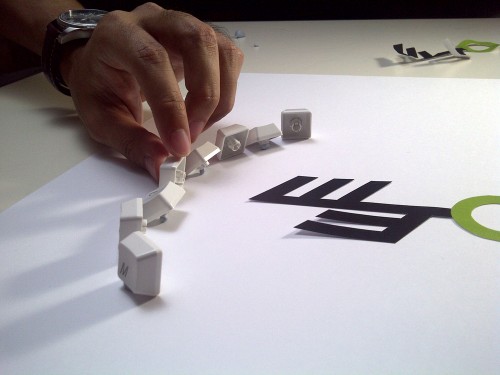
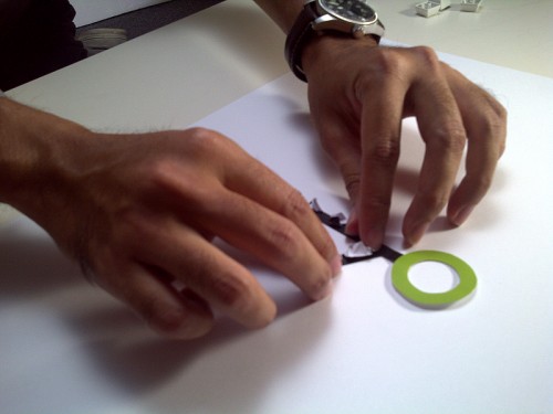
W3-O believes in taking the time to attain this balance- to always be in the “prime of life”. Driven by passion and yes, a sense of fun, we’ve created a little Stop Motion Animation signoff that we could share with you good people!


http://www.youtube.com/v/SSEzrjM7pf0

Why stop motion specifically you ask? For starters, we were truly inspired by Wallace and Gromit and decided hey, why not put our passion to use and share with you good people!

W3-O Stop Motion

One by one…

W3-O Stop Motion

bit by bit…. More challenging than meditation…

So, what’s your passion?

beyond the studio // May 25, 2011

Media Development Authority, Singapore

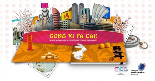
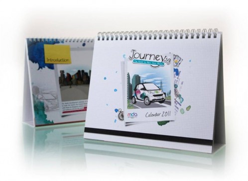
As a member of the design board panel for the Media Development Authority of Singapore (MDA), W3-O is occasionally tasked with designing collaterals for the agency. The first project undertaken was the creation of MDA’s 2010 Table Stand Calendar, Christmas E-Card, and Chinese New Year E-Card.

MDA is generally seen as the “fun” government agency as it works towards advancing the media industry and the like. And, although the theme for 2010 – Journey Towards New Asia Media – was previously used, W3-O gave it a fresh look by creating a travel scrapbook-themed calendar which was included in MDA’s Annual Report and well-received by clients. Additionally, the Interactive Team designed Christmas and Chinese New Year E-cards that utilised the novel concept of a pop-up storybook that carried greetings for the respective festivals.

MDA Christmas Card 2010

MDA Chinese New Year e-Card 2011

MDA Calendar 2011
MDA Calendar 2011

beyond the studio // April 19, 2011

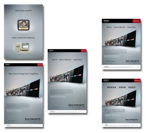
Sony Internet TV Campaign

first tv . then internet . now Sony

Recently, W3-O was commissioned to roll out “Sony Internet TV” campaign for Sony Singapore, where we supported by localising/adaptating to the local medium.

Various ads for various medias

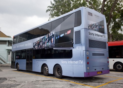
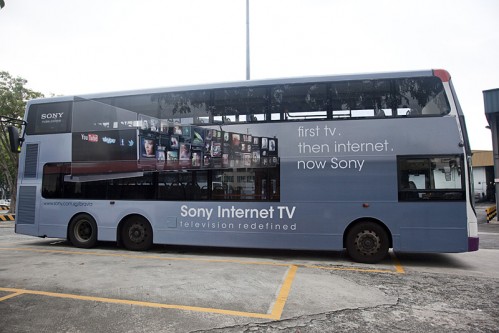
Spot Sony Internet TV double-deckers through out the islandSpot Sony Internet TV double-deckers through out the island
Spot Sony Internet TV double-deckers through out the island

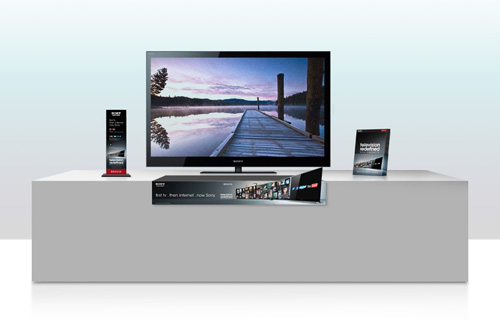
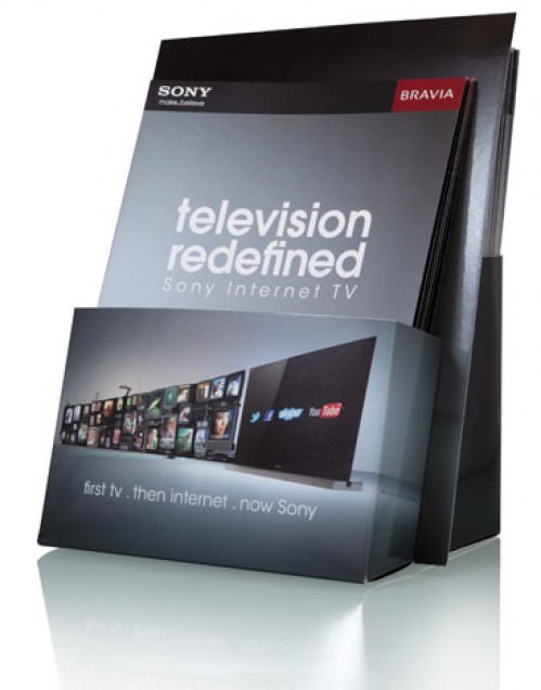
On the regional level, W3-O also supported Sony on their POP design and production for the campaign.
In-store collaterals

Brochure holder
Brochure Holder

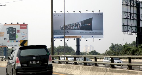
Keep a look out for all these materials in Asia Pacific region. You will be able to see some billboards and other interesting stuff done by local Sony Sales companies, for example the one that we spotted in Jakarta, Indonesia, and their latest TV Commercial.

Sony Internet TV Billboard in Jakarta


Commercial Ad
http://www.youtube.com/v/fJuLEglvSJY

However, there is one thing that you should really check out – the new range of Sony Internet TV! They are truly awesome! Television is truly redefined now!

beyond the studio // April 13, 2011

HEART ROCK – Japan Relief 2011

W3-O is one of the official partners of HEART ROCK: Japan Relief 2011.

Spearheaded by local band, MONOCHROME, with their charity initiative – “Heart Rock”, the event will showcase performances by other prominent musicians and bands such as Caracal, The Dirt Radicals, Maia Lee, We The Thousands, Amterible, Fatskunks, MONOCHROME themselves, as well as the winner of Hard Rock Café’s “Battle Of The Bands 2011”, B.A.R.B.

“Heart Rock : Japan Relief” is themed with the tagline “Let I Be We” to showcase how various Singaporeans from different walks of life can unite together to help make a difference in our society today. “Heart Rock” is an initiative that hopes to inspire others to take that small step in caring for the needy and less fortunate, making compassion and charity a way of life.

At the same time, The Humanity Forum donated 2,000 pin buttons for the fundraising drive. We hope that this contribution could help the fundraising drive to reach its targeted amount of S$ 50,000.00, which will be donated to MERCY RELIEF SINGAPORE for their humanitarian missions to Japan.

May The Force be with HEART ROCK and Japan!

beyond the studio // January 19, 2011

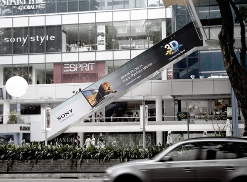
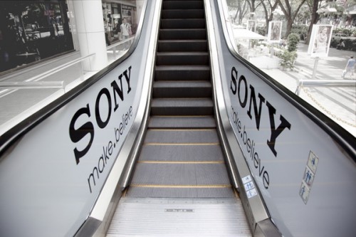
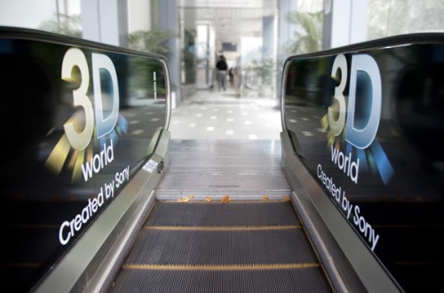
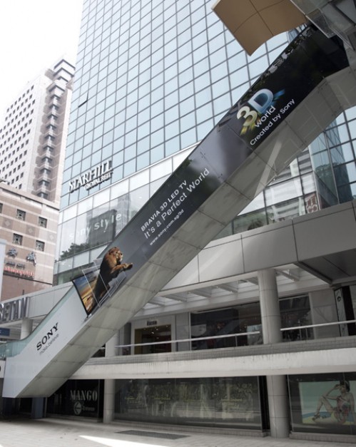
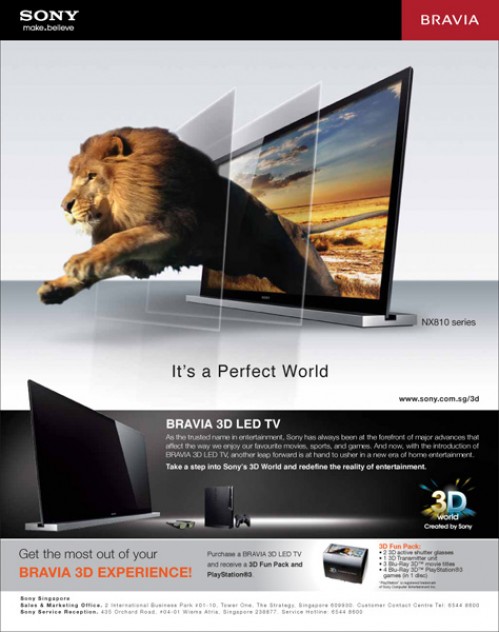
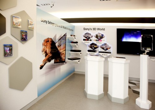
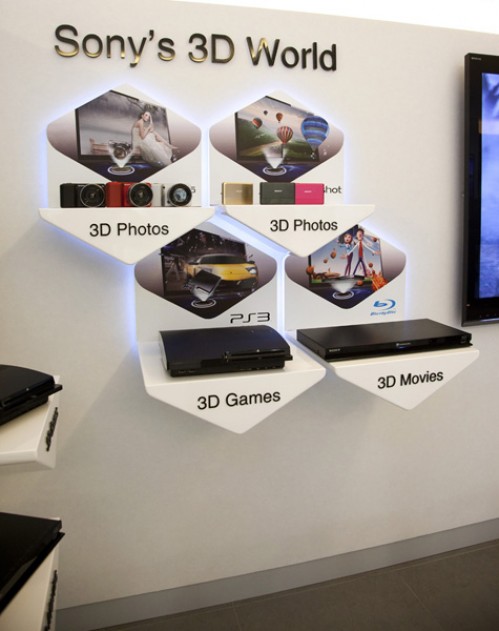
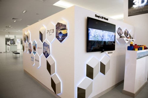
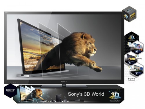
Sony’s 3D World Campaign

Fall into the world of 3D with Sony, where everything comes alive and out of your screen.

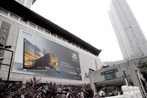
Sony appointed W3-O Design Lab to launch their 3D World Campaign. It was an experience to be remembered. We produced a wide range of collaterals to support their campaign, both locally and regionally.

Giant Banner at CK Tang shopping centre, Singapore
Giant Banner at CK Tangs shopping centre, Singapore

Outdoor escalator at Wisma Atria, Singapore

Outdoor escalator at Wisma Atria, Singapore

Outdoor escalator at Wisma Atria, Singapore

Outdoor escalator at Wisma Atria, Singapore

Press ads
Press ads

In-store display graphics (Large Unit)

In-store display graphics (Large Unit)

In-store display graphics (Large Unit)

 In-store display graphics (Small Size)

In-store display graphics (Small Size)

NX810 with Shelftalker P.O.P
Point-of-Purchase (POP) Display

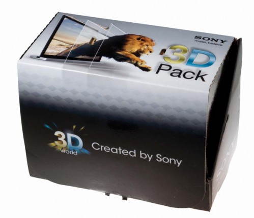
3D Box Packaging
Packaging

beyond the studio // December 13, 2010

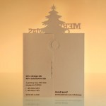
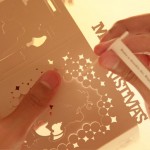
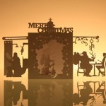
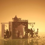
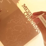
Handcrafted Christmas Card 2010

W3-O Christmas cards have always tried to adopt a unique form or design prior to any Christmas cards that have been around.

We aim to have all our Christmas cards send off a truckload of “candy cane” joy and excitement to our recipients.

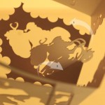
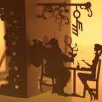
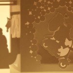
For our 2010 card, we wanted to use intricacy to spread the Christmas spirit around. Craftsmanship was the key aspect that we wanted to showcase. Apart from the craftwork, elements of Christmas must be present to bask in this tasteful joy. And what’s Christmas without our pouty-bellied and snowy white beard, Mr Santa “Hoho” Claus? We showed Mr Santa doing odd things, perhaps a side of Santa we have yet to witness, to bring a new scene of imagination and to put a smile on every recipient’s face.

Shelf longevity was something we decided to push as well, hoping that our clients and friends will display it on their desks/shelves till our next card comes rolling merrily along.


beyond the studio // June 2, 2010

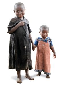
A difference made for these little people with big dreams.

It all started with a vision…

“Our vision for every child, life in all its fullness;
Our prayer for every heart, the will to make it so.”

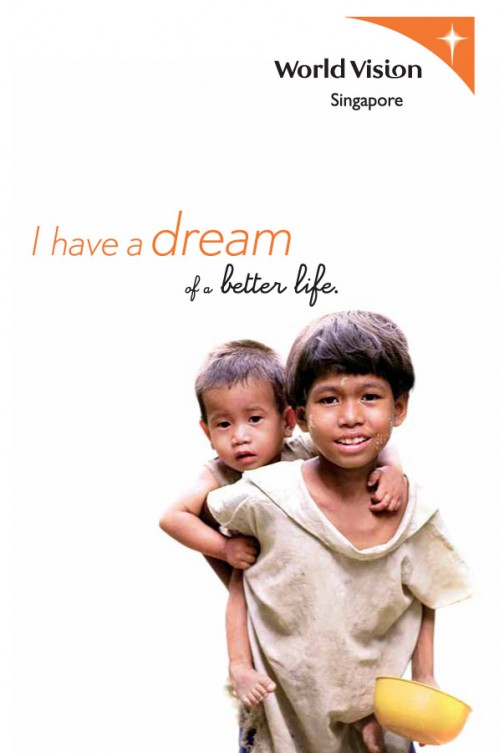
Every child is entitled to dream, whether big or small, and World Vision Singapore is there to help fulfil the dreams of the less fortunate children from over 100 different countries.

The story goes…

Some time back in June 2010, W3-O received a call from World Vision Singapore, who was keen in getting help to revamp their current collaterals. They were pleased with the previous CSR projects that we’ve done for other NGOs, and wanted an agency that is not only passionate about giving back to society but also understand the works of charity organisations.

We were tasked to conceptualise a Marketing Kit, comprising of various collaterals that would provide information and convey their vision to corporate entities, individuals and youths.

It was a rather challenging project with the strict Corporate Identity (CI) guidelines we had to adhere to. Budget was another hurdle we had to cross, as World Vision Singapore would rather pump more resources to their beneficiaries than on marketing efforts.

However, geared with our “never say die” attitude and creative expertise, we accelerated head-on to maximise whatever resources given to us. At the same time, ensuring the collaterals makes an emotional connection to the people in Singapore.

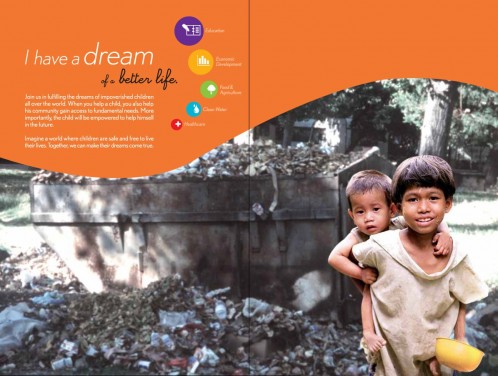
Overall packaging – Brochure folder

In most instances, what we see/know and the reality are worlds apart. Also, it’s hard to imagine not having proper living conditions in our clean and green Singapore, with high-rise apartments and sky scrapers all over.

After our many brainstorming sessions, the main direction we wanted to head towards is to portray an emotion that reaches out to pull the heart strings of the public, and also to create awareness as to what’s happening around us.

Very much like the “Before & After” concept, we came up with a 2-tier messaging of “What you are expecting” and “What you didn’t expect”.

“What you are expecting”

Brochure folder - Cover
Brochure folder – Cover

“What you didn’t expect”

Brochure folder - Inside
Brochure folder – Inside

Once the target audience opens the folder, they would see the children on the cover actually living in the dumpster.

In this day and age, it’s only normal or rather human that we only see what’s on the surface. Simply because we’re fortunate enough to have proper living conditions. The folder will be the glue that holds all other collaterals together. So with this mechanic at play, the target audience would realise the dire situation these kids are facing every day, be drawn emotionally by the visuals and hopefully to act on their emotions.

Brochures concept

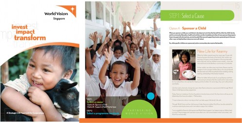
We needed to conceptualise 3 different sets of brochure – corporate, individual and youth. The tone and mood to portray for each is vastly different, adding on the fact that we had to comply with not only the CI guidelines but also the information given.

The concept for corporate entities had to look clean and more serious as they needed as much information as possible.

Corporate Brochure – Cover / Corporate Brochure – Inside

As for the individual brochure’s layout, it is less complicated as they don’t require that extensive amount of information.

World Vision Brochure

Individual Brochure – Cover / Individual Brochure – Inside

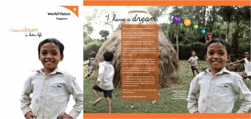
And saving the best for last, our biggest challenge yet – how could we appeal to the youths yet at the same time keep in line with the CI guidelines? Youths would definitely not be interested and engaged if we use the same design and layout as the above two.

So tapping into our youthful hearts, we made it exciting, fun and easy to read by using more pictures to bring the message across.

World Vision Brochure

Youth Brochure

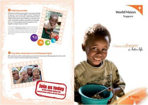
We also added an extra feature that helps maximise cost-effectiveness. We made it such that the brochure could double up as a poster on the flipside! Schools will then be able to put it up on their notice boards, or youths themselves can paste it on their walls.

Pull-Out Posters (Inside Brochure)

Poster on brochure’s flipside

Additional items

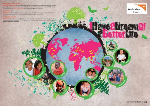
World Vision Singapore hopes that the donors support/sponsor the children in reaching their dream, and not just a “drop & go” affair. Because ultimately, it’s about the bigger picture of how we can sustain the growth and development of the less fortunate.

With their extensive journey of sponsoring a child, W3-O took a step further and transformed their current poster into an interactive and engaging “board game”. The target audience would not only have a clearer picture, but a fun time on the journey that they will be embarking on with their sponsored child.

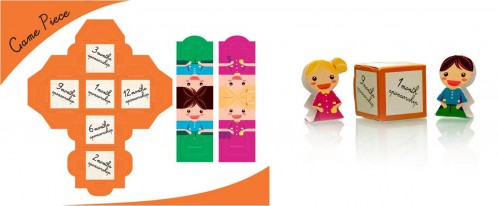
So how does this game work? Simple! It comes with the main board piece and attached game pieces of a dice and characters.

Milestones into educational game

“Fulfilling a Dream with World Vision” board game

World Vision Game Piece

Game pieces, supplied flat & after folding

  1. Roll your folded dice.
  2. Move your folded character that represents the boy or girl you are sponsoring, according to the number on the dice you’ve rolled.
  3. You’ll be able to “travel” the journey with your sponsored child, from them getting a new toothbrush, to receiving access to medical support and eventually reaching their dream.

A smile goes a long way

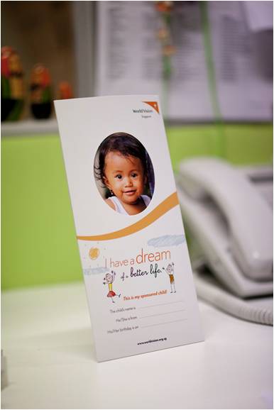
Mail-friendly photo frame

We all like to be remembered in one way or another, let alone a child who is in need of our support. What’s better than a photo frame to remember someone by? W3-O came up with a simple cost-effective photo frame where donors can proudly display the picture of their sponsored child.

Just by looking at this cute little face, doesn’t it brighten up your day already? 🙂

Just a little something extra

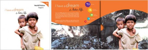
We also designed a CD sleeve that’s of similar design to the brochure folder. This would be used for generic purposes if interested parties who want to know more about World Vision Singapore, and how to go about doing their part for the leaders of tomorrow.

CD Sleeve

CD Sleeve

A final note

Helping our clients in maximising cost-effectiveness is one of W3-O’s driving forces to success! We believe in attainting a win-win situation, building and maintaining long-term relationships with our clients.

It’s truly a blessing to be able to pass goodness on isn’t it? Make your day better by making a difference in others. To quote the late King Of Pop, Michael Jackson’s song, “Heal the world; make it a better place; for you and for me and the entire human race”, just says it all.

Are you ready to heal the world with us?

w3-o

A partially pro-bono project – Another CSR Creative Sponsorship by W3-O Design Lab